Yield Curve Says a Recession Could Become Reality Very Soon
A recession in the U.S. economy could arrive very soon. If you are buying stocks thinking that economic growth could be ahead, be very careful. You could be setting up your portfolio for disappointment.
You see, there’s one key recession indicator currently flashing red, and many investors are overlooking it.
Advertisement

What is that indicator? Yield curve. It’s essentially a chart that plots the yields of various government bonds of different maturities.
Economists use this chart to predict if a recession is nearing or if economic growth is ahead.
If the yield curve is trending higher (meaning bonds with short-term maturity have lower yields than bonds with long-term maturity), there is economic growth.
Once the yield curve starts to flatten, or worse, starts to become “inverted” (meaning that bonds with short-term maturity have higher yields than the bonds with long-term maturity), it means that a recession is nearing.
Look at how the yield curve currently looks in the chart below. It is “normal,” suggesting that things are fine for the U.S. economy—for now.
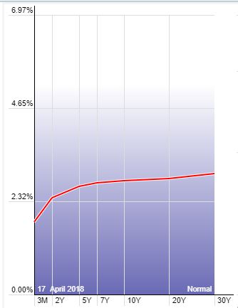
Chart courtesy of StockCharts.com
Look Closely at Short-Term and Long-Term Bonds
But don’t get too comfortable. Look at another chart below. It plots the difference between the 10-year U.S. Treasury and the two-year U.S. Treasury.
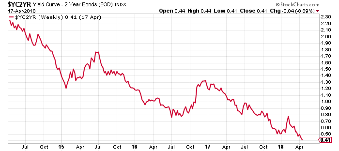
Chart courtesy of StockCharts.com
Over the last few years, this difference has really declined. It’s just 0.4% now. In 2015, the difference between yields on long-term and short-term U.S. bonds was 2.2%.
Putting it in simple words, the chart above is saying that the yield curve is flattening. Yields on short-term and long-term bonds are closing in. This means that an economic slowdown and outright recession could be looming for the U.S. economy in the near term.
Take a Look at the Bigger Picture
In case you are not convinced, let’s dig a little bit deeper…
Look at the long-term chart of the difference between the 10-year U.S. Treasury and the two-year U.S. Treasury. Pay close attention to the circled areas.
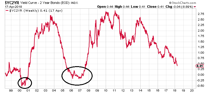
Chart courtesy of StockCharts.com
Prior to the recessions of 2001 and 2007–2009, this difference closed in at zero. A few months later, the data started to show a recession. So, this indicator is really important to watch. It predicted the last two economic slowdowns in the U.S. economy correctly.
U.S. Economic Outlook: Late 2018 and Early 2019 Could Be Bad for the U.S. Economy
Dear reader, if you listen to the mainstream media, there’s a lot of noise about the yield curve, but it’s along the lines of “this time it’s different.”
Looking at the yields, I can’t help but be pessimistic about the U.S. economy going forward. I believe that a recession could become reality in late 2018 and early 2019. All the stars are lining up perfectly for it. Obviously, with time and additional economic data, we will know more.
With all this said, stock investors beware. If the U.S. economy is about to enter a recession, we could be in the midst of making a stock market top.
Don’t get lured by the false optimism of economic growth. Remember, market tops usually happen before the economy enters an economic slowdown. During a recession, markets tumble. And they form a bottom just before the economy is about to enter a period of growth.